We get navigation bar as a reference from website of bhat bhateni stores because it looks simple and clean which is easier to understand for costumer. in additional we added extra css like changing color blue to black and also font and font size. We had use hover to make changes in color of navigation links, As you can see when you hover the link there is changes of color from white to red.


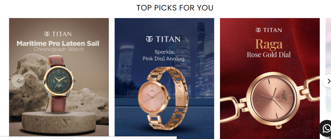
We took Home page as a reference from website of Titan nepal we had some changes in See Offer button where we added hover effect with transition, We haven't used javaScript in our home page while Titan napal had use javaScript to change the slides of watches.
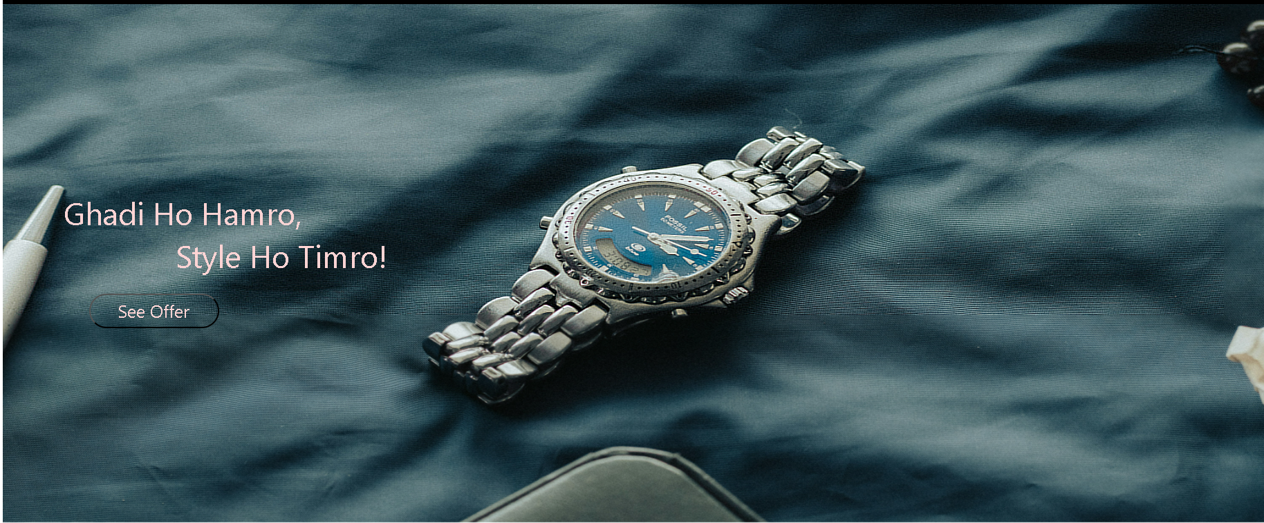
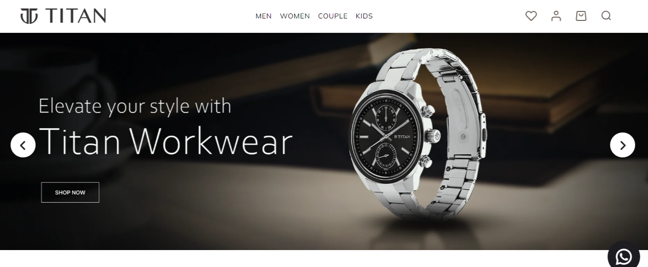
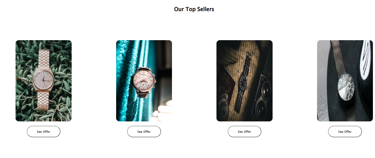
Second photo is also part of home page which is referenced from same website but, we had some changes like we added see Offer options under each photos and other things are as it is. We had use display flex to make it a flex container and justify content space-around property ensures that the space around the flex items is evenly distributed.
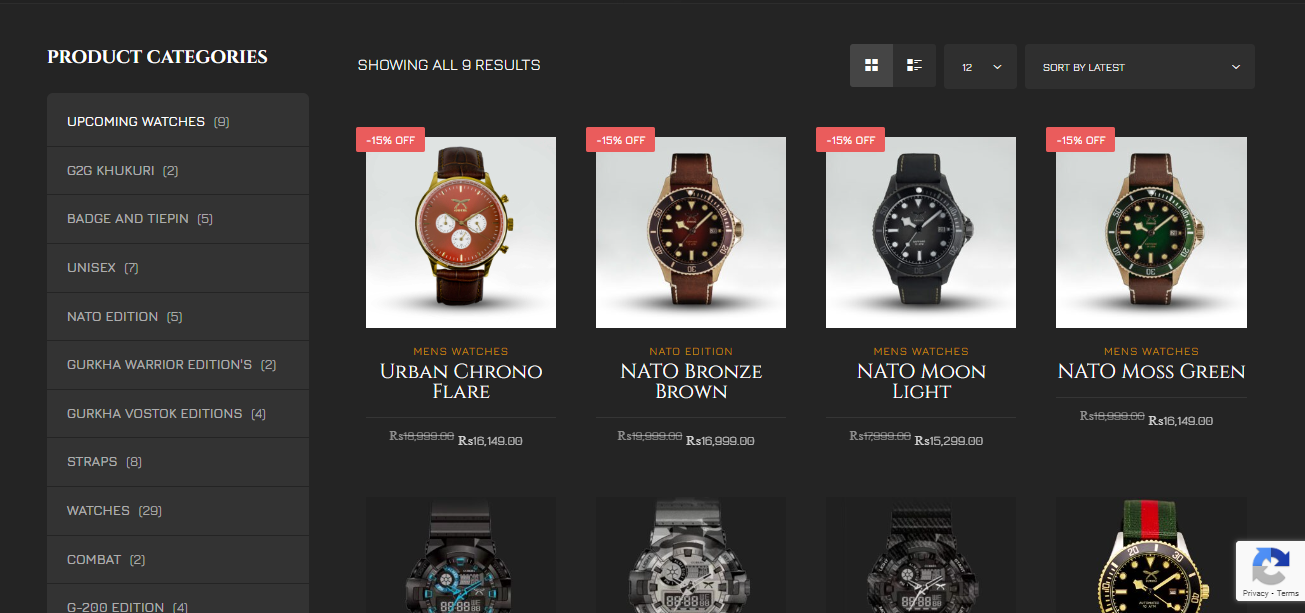
We took Product page as a reference from website of Gurkha watch. As we can see the website of gurkha watch has product-categories but, we had remove product-categories from our website. Also, We added hover effect with transition, border radius, box shadow, del tag for new price and also we used marquee below the navigation bar of product page which attract customers.

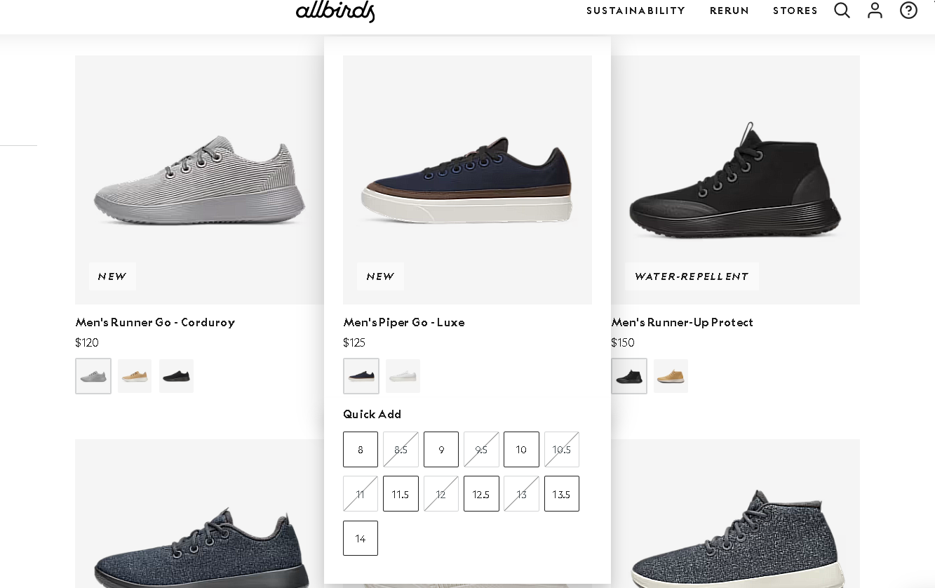
We took our refrence from the website AllBirds.As we hover our mouse over
the products it pops vertically downwards and shows details,
like how the shoe sizes are shown when we hover our mouse over their
products.
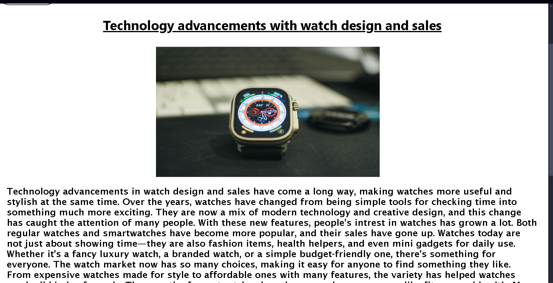
Our blog page was inspired from the website BraveryGo.We especially liked how the blog was seprated into two parts for people so they can either read a short description or study about it more. Likewise, our blog page also contains detail information about impsct of technology on the watch industry and consumer trends.We have also included advantages and disadvantages of same topic which you can get after clicking Read more button and we have also used table inside this page.

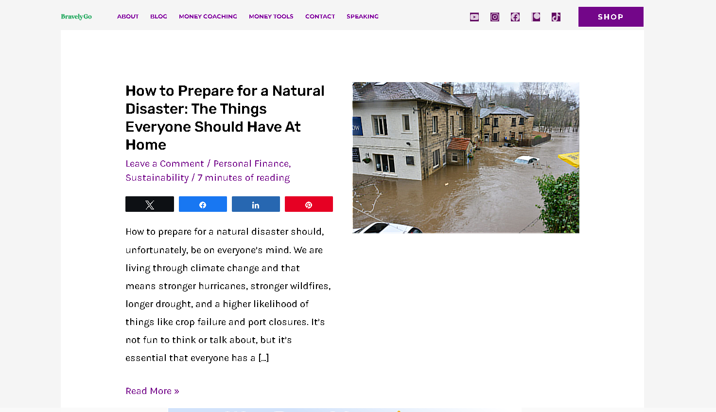
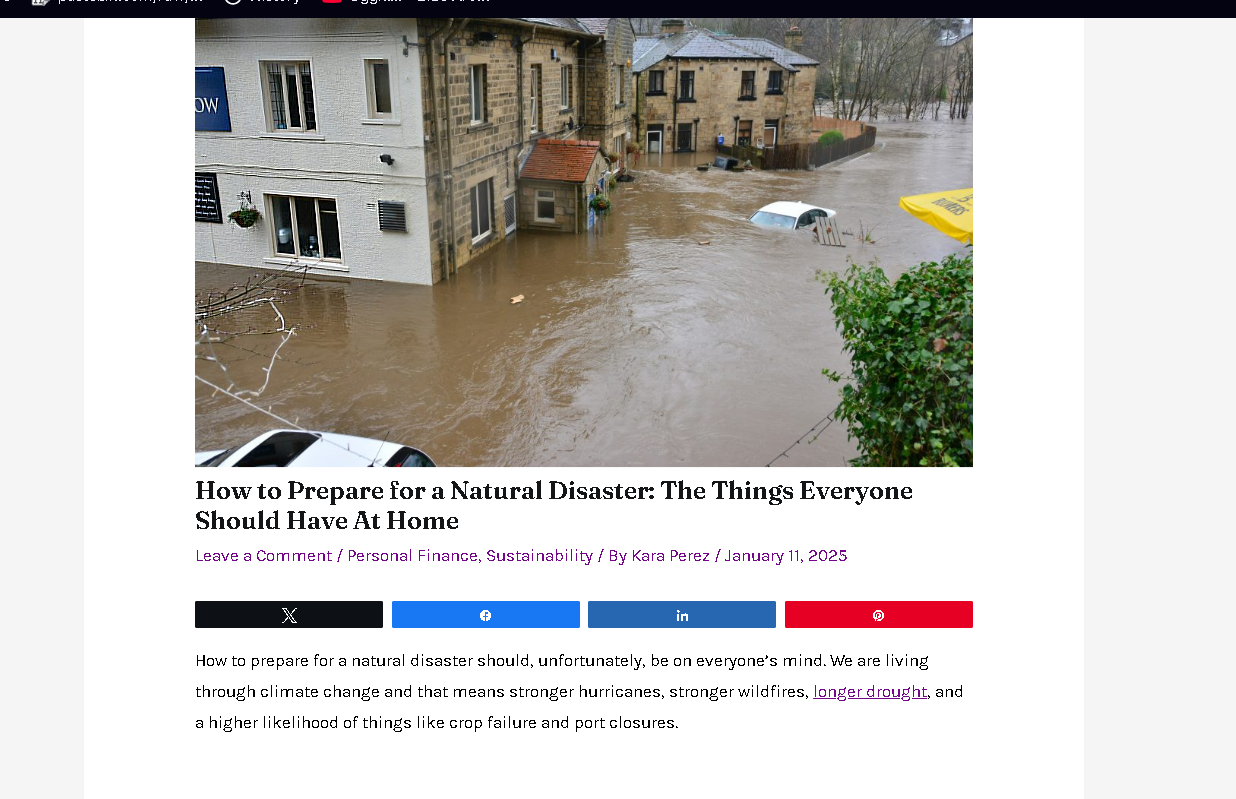
Our inner blog was inspired from the same website.We loved the theme of
displaying the blog in 2 seperate parts.We especially liked how the blog
was seprated into two
parts for people so they can either read a short description or study
about it more.
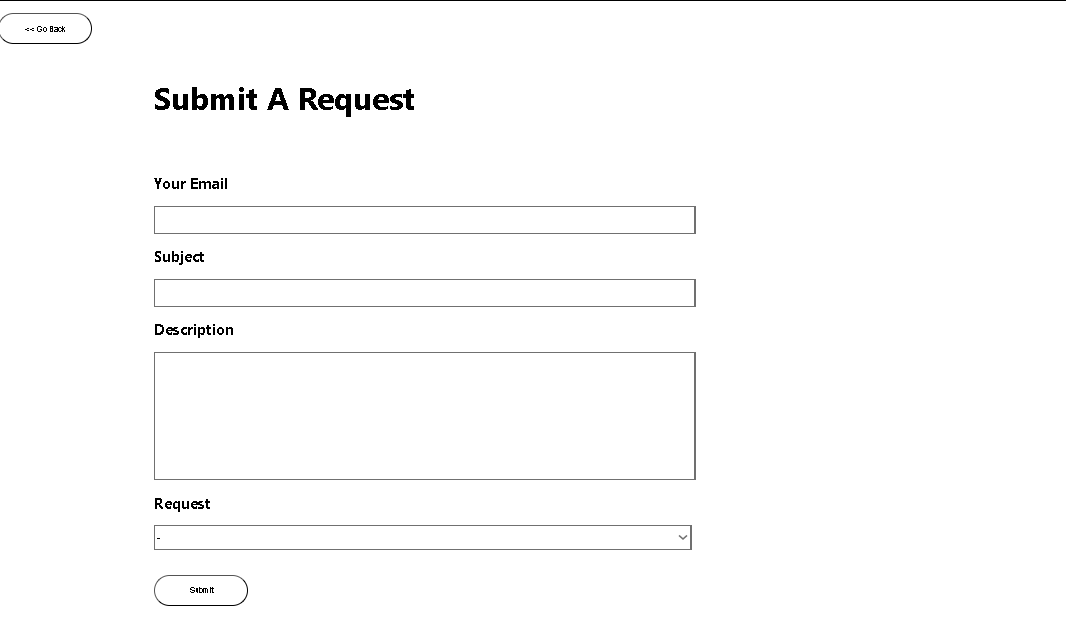
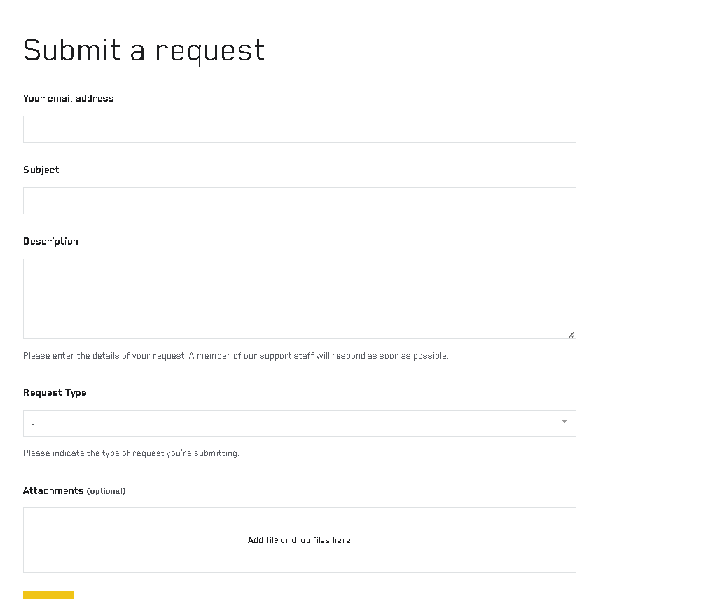
Our form page was designed from the inspiration of MASTER&DYNAMIC webside which can suit perfectly in our website and matches our simple theme of black and white.
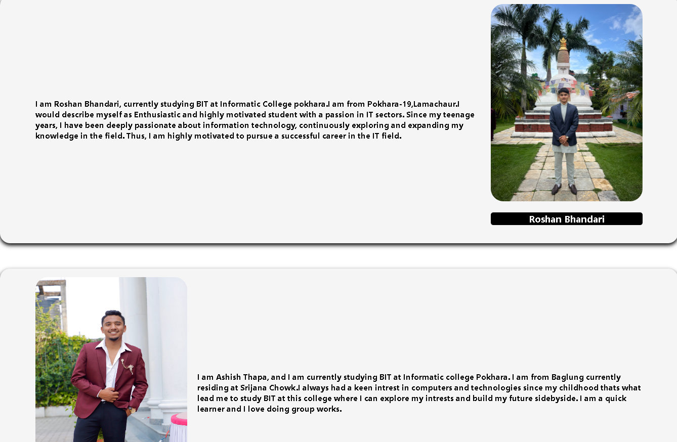
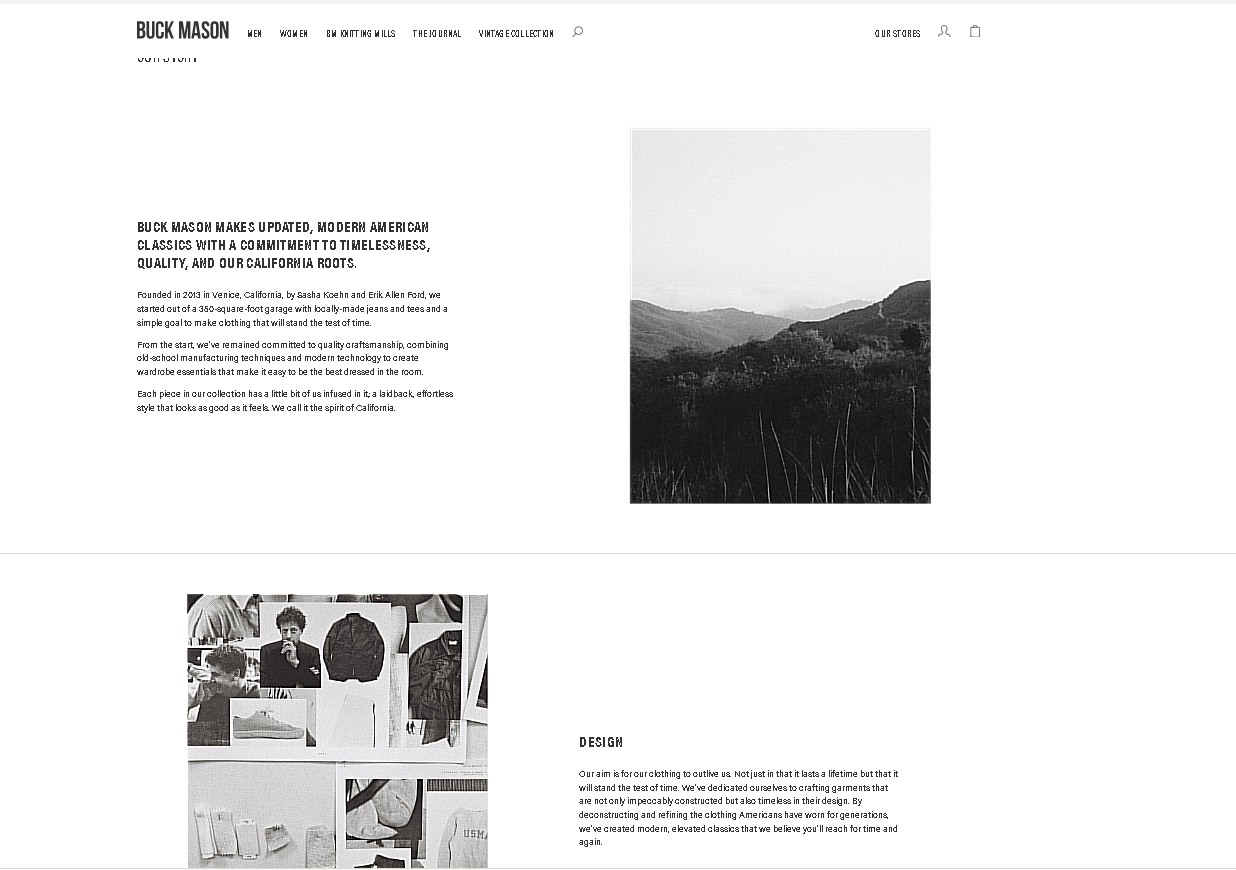
Our About us page was inspired from the website Buckmason.We liked how their story was shown in an alternating pattern and thought our page would be a perfect fit for something like that. Similarly, We added our names below our photo in our AboutUS page while there is no any names below pictures of buckmason website.